Don't hide the worlds behind HUDs
Just as much as I don’t like having magically updated maps in games (see the joys of leaving the map behind), I also get taken out of the experience by the two-dimensional HUDs (heads-up display) plopped onto the screen. This right here is a familiar sight:
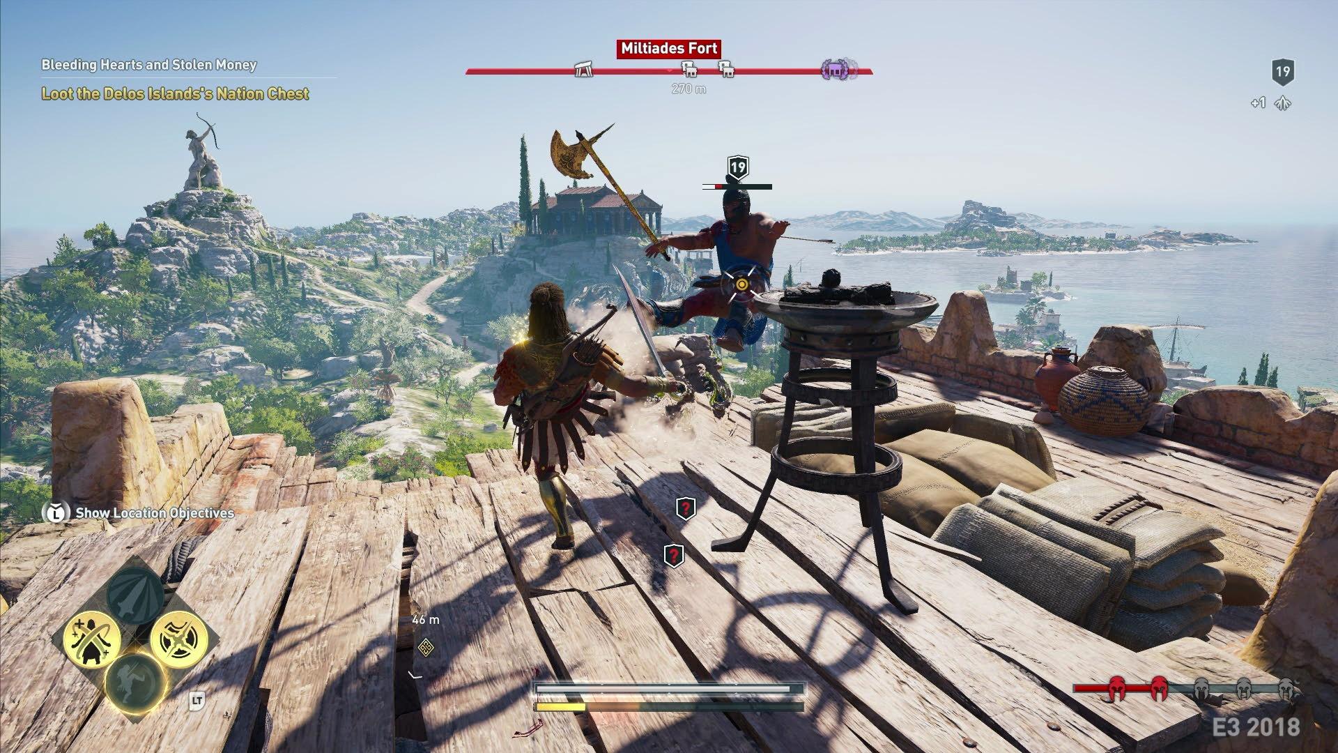 Yes, Assassin’s Creed Odyssey UI is an egregious example. Every corner, side, and even the middle of the screen are taken up by 2D HUD elements.
Health, fatigue, ammo counter, compass, mini-map, enemy health, current quest… You’ve built this beautiful world for me to immerse myself in, and you’re taking up most of the screen real estate by some text, bars, and icons. That’s just bad taste: why is it I’m having to try to take a sneak peak at the environments that the developers lovingly crafted - the environments hidden behind the HUD elements?
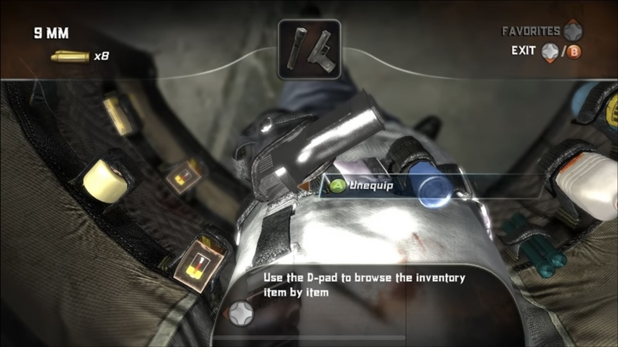
Oh, and don’t just tell me to disable HUD in-game. The HUD’s important. That’s how I know my health is low or I’m about to run out of bullets. That’s how I know where to go or what I have equipped. The solution here is a bit less blunt than turning off all the HUD elements.
The concept is often referred to as diegetic UI: let’s dig into a couple of examples where the games have done this right.
I remember thinking about the physicality of the world when playing Far Cry 2 for the first time. The bloodied screen, malaria effects, and a physical map all made the world feel so much more real. Another one of the 2008s AAA titles is known embodying diegetic UI design principle: Dead Space. Protagonist’s health bar and stasis meter are on his back, the ammo counts and fire modes shoot out of the weapons, and inventory is brought up through a hologram right in front of Isaac. For a sci-fi setting - that’s perfect. All the information we, the players, need is available in world.
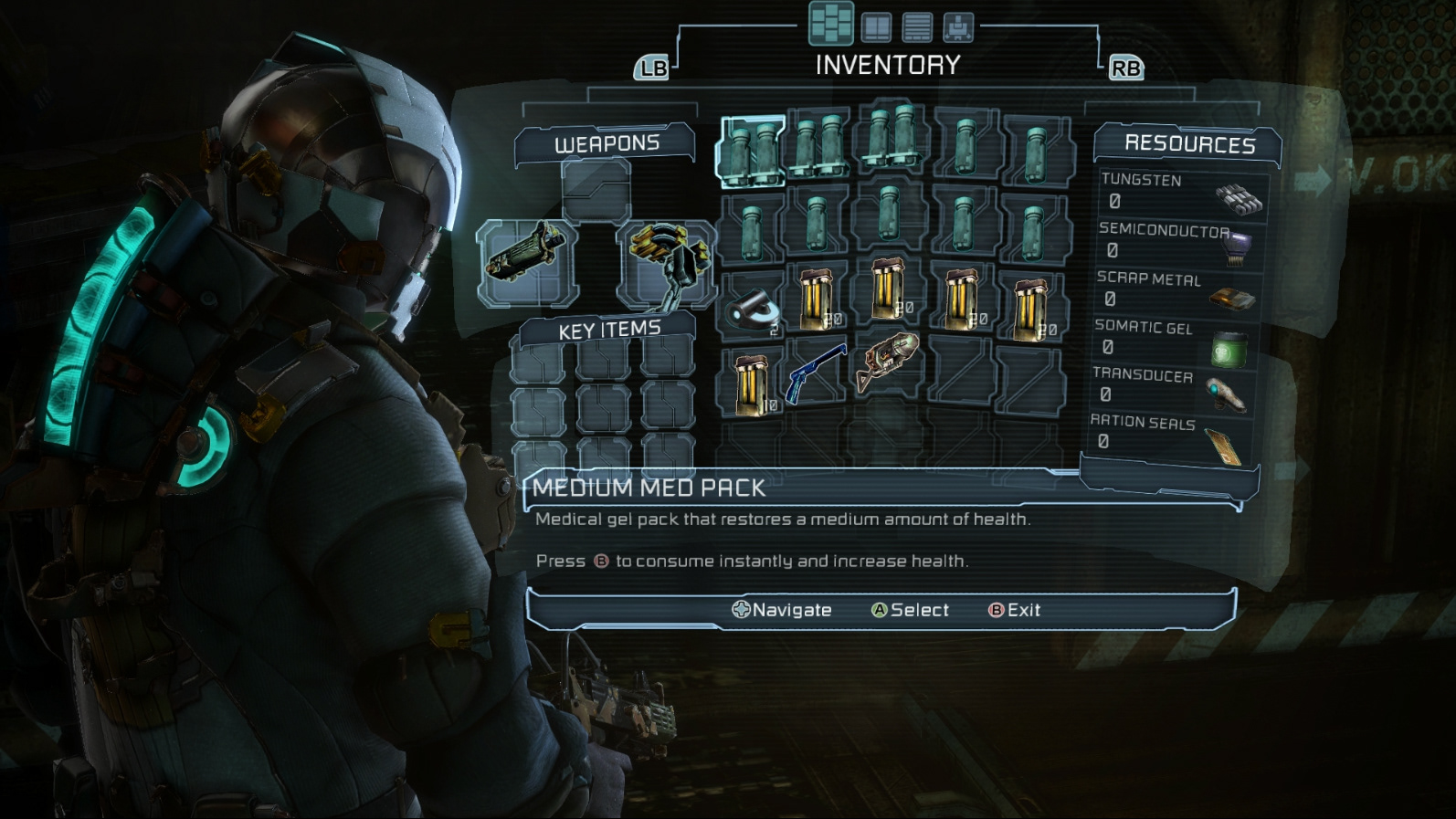 Dead Space inventory screen pops up in front of the protagonist. Also note the vertical bar on Isaac’s back (health bar) and a semicircle (stasis bar).
Now, ultimately these are still the same two-dimensional menus integrated into the game: inventory is still a familiar grid, and ammo counters are pulled right from the corner of your screen.
Well, some games have taken this further. Meet Astroneer: a poster child for diegetic UIs. Player’s backpack has slots you can add or remove items too, and those items are always visible in game. You can grab these at any time. Astroneer doesn’t strive for realism, but this simple mechanic does wonder for pulling you into the world and making the experience feel a lot more tactile.
Best part is that you engage with the backpack exactly the same way you’d engage with other items in the world. It’s simple click and drag, the same way of interacting with every object you can see (Astronner uses a free floating mouse cursor on PC - I’m unsure how interaction’s handled with a gamepad).
Astroneer doesn’t religiously adhere to the principle - you still have a compass, pop-ups, and even a small portable computer - which is still better than a magical UI popping out of the void. But I really like how it integrated the inventory system with the rest of the world.
Now onto the deep dark secrets. I might upset some people, but I enjoyed Alone in the Dark 5 (yet another game from 2008 - quite a year for gaming). I was young, impressionable, and it was really cool. I’m familiar with the criticism: a thoughtful puzzle game became a mindless action title, controls were clunky, story was forgettable (yeah, I don’t remember the premise), the game was a mishmash of poorly implemented ideas, and of course - the bugs, lots and lots of bugs. But you can set zombies on fire with a homemade flamethrower and that’s all I cared about.
But what makes Alone in the Dark 5 worth mentioning in polite society is the way inventory is implemented. You hit the inventory button, and Edward Carnby opens up his jacket and looks down. Here’s what you see:
 Yup, that’s a view of every item you have. I think it’s cool seeing these in-world.
Every item has a slot in your jacket (the protagonist probably makes a lot of noise when walking), giving each item a dedicated physical space. Even better - the game doesn’t stop as you look through your inventory, making pulling out a roll of bandages a dangerous affair. You get rewarded for being able to navigate the inventory fast, too.
Now, was it clunky? I think so - I haven’t played this game in over 15 years, and I’m sure it was worse than I remember. But I still think the idea of using in-world objects to represent in-game HUD elements is underutilized.
There’s a danger here, too, though. All of this in-game-menu-navigation needs to serve a purpose and connect with the rest of the gameplay, otherwise you’ve just got a chore on your hands. Looking at you, Red Dead Redemption 2 animations. Seeing Arthur Morgan ruffle through a cabinet for the first time is awe-striking, but I found myself yelling at the screen “pick it up already” after my hundredth. I always contrast this with the pick up animations in Legend of Zelda: Breath of the Wild - a lazy grab for an object which doesn’t even slow Link down. And that makes sense, because Breath of The Wild is optimized around collecting lots of monster parts casually and quickly.
The takeaway here isn’t that every game needs to be a hardcore reality simulator, but the fact that UIs should be a seamless part of the world they’re built to serve. Games like Dead Space, Astroneer, and even Alone in the Dark 5 do just that - by moving beyond simply pasting information on the screen. By experimenting with diegetic UI, developers can create a more cohesive, believable, and ultimately more immersive experience: I look forward to seeing more games experiment with this idea.
Oh, and do let me know if there are games that demonstrate aspects of diegetic UI design that I haven’t yet mentioned.
Comments
Respond directly on Bluesky (threads shown below) or Medium (view comments there).